Solving and Graphing Linear Inequalities in Two Variables
Learning Objective
· Represent linear inequalities as regions on the coordinate plane.
· Determine if a given point is a solution of a linear inequality.
Introduction
We use inequalities when there is a range of possible answers for a situation. “I have to be there in less than 5 minutes,” “This team needs to score at least a goal to have a chance of winning,” and “To get into the city and back home again, I need at least $6.50 for train fare” are all examples of situations where a limit is specified, but a range of possibilities exist beyond that limit. That’s what we are interested in when we study inequalities—possibilities.
We can explore the possibilities of an inequality using a number line. This is sufficient in simple situations, such as inequalities with just one variable. But in more complicated circumstances, like those with two variables, it’s more useful to add another dimension, and use a coordinate plane. In these cases, we use linear inequalities—inequalities that can be written in the form of a linear equation.
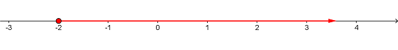
Inequalities with one variable can be plotted on a number line, as in the case of the inequality x ≥ -2:
Here is another representation of the same inequality x ≥ -2, this time plotted on a coordinate plane:
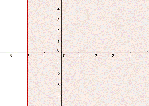
On this graph, we first plotted the line x = -2, and then shaded in the entire region to the right of the line. The shaded area is called the bounded region, and any point within this region satisfies the inequality x ≥ -2. Notice also that the line representing the region’s boundary is a solid line; this means that values along the line x = -2 are included in the solution set for this inequality.
By way of contrast, look at the graph below, which shows y < 3:
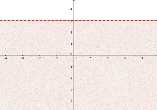
In this inequality, the boundary line is plotted as a dashed line. This means that the values on the line y = 3 are not included in the solution set of the inequality.
Notice that the two examples above used the variables x and y. It is standard practice to use these variables when you are graphing an inequality on a (x, y) coordinate grid.
Two Variable Inequalities
There’s nothing too compelling about the plots of x ≥ -2 and y < 3, shown above. We could have represented both of these relationships on a number line, and depending on the problem we were trying to solve, it may have been easier to do so.
Things get a little more interesting, though, when we plot linear inequalities with two variables. Let’s start with a basic two-variable inequality: x > y.
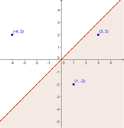
The boundary line is represented by a dotted line along x = y. All of the points under the line are shaded; this is the range of points where the inequality x > y is true. Take a look at the three points that have been identified on the graph. Do you see that the points in the boundary region have x values greater than the y values, while the point outside this region do not?
When plotted on a coordinate plane, what does the graph of y ≥ x look like?
A) 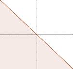
B) 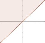
C) 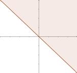
D) 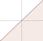
Plotting other inequalities in standard y = mx + b form is fairly straightforward as well. Once we graph the boundary line, we can find out which region to shade by testing some ordered pairs within each region or, in many cases, just by looking at the inequality.
The graph of the inequality y > 4x − 5.5 is shown below. The boundary line is the line y = 4x − 5.5, and it is dashed because our y term is “greater than,” not “greater than or equal to.”
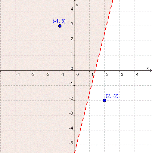
To identify the bounded region, the region where the inequality is true, we can test a couple of coordinate pairs, one on each side of the boundary line.
If we substitute (-1, 3) into y > 4x − 5.5, we find 3 > 4(-1) − 5.5, or 3 > -9.5. This is a true statement. It looks like we need to shade the area to the left side of the line.
On the other hand, if we plug (2, -2) into y > 4x − 5.5, we find -2 > 4(2) − 5.5, or -2 > 2.5. This is not a true statement, so the point (2, -2) must not be within the solution set. Yes, the bounded region is to the left of the boundary line.
Making sense of the importance of the shaded region in an inequality can be a bit difficult without assigning any context to it. The following problem shows one instance where the shaded region helps us understand a range of possibilities.
Celia and Juniper want to donate some money to a local food pantry. To raise funds, they are selling necklaces and earrings that they have made themselves. Necklaces cost $8 and earrings cost $5. What is the range of possible sales they could make in order to donate at least $100?
The first step here is to create the inequality. Once we have it, we can solve it and then create a graph of it to better understand the importance of the bounded region. Let’s begin by assigning the variable x to the number of necklaces sold and y to the number of earrings sold. (Remember—since this will be mapped on a coordinate plane, we should use the variables x and y.)
| amount of money earned from selling necklaces | + | amount of money earned from selling earrings | ≥ | $100 |
| 8x | + | 5y | ≥ | 100 |
We can rearrange this inequality so that it solves for y. That’s the slope-intercept form, and it will make the boundary line easier to graph.
| Example | |||||
| Problem | 8x | + | 5y | ≥ | 100 |
|
| 8x − 8x | + | 5y | ≥ | 100 − 8x |
|
|
|
| 5y | ≥ | 100 − 8x |
|
|
|
|
| ≥ |
|
|
|
|
| y | ≥ | 20 − |
| Answer |
|
| y | ≥ | − |
So the slope intercept form of the inequality is ![]() . Now let’s graph it:
. Now let’s graph it:
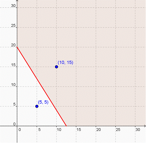
The shaded region represents all the possible combinations of necklaces and earrings that Celia and Juniper could sell in order to make at least $100 for the food pantry. It’s quite a wide range!
We can look at the two ordered pairs for confirmation that we have shaded the correct region. If we substitute (10, 15) into the inequality, we find 8(10) + 5(15) ≥ 100, which is a true statement. However, using (5, 5) creates a false statement: 8(5) + 5(5) is only 65, and is thus less than 100.
Note that while all points will satisfy the inequality, not all points will make sense in this context. Take (21.25, 10.5), for example. While it does fall within the shaded region, it’s hard to expect them to sell 21.25 necklaces and 10.5 earrings! The women can look for whole number combinations in the bounded region to plan how much jewelry to produce.
Summary
Inequalities can be mapped on a number line or a coordinate plane. When graphed on a coordinate plane, the full range of possible solutions is represented as a shaded area on the plane. The boundary line for the inequality is drawn as a solid line if the points on the line itself do satisfy the inequality, as in the cases of ≤ and ≥. It is drawn as a dashed line if the points on the line do not satisfy the inequality, as in the cases of < and >. Using a coordinate plane is especially helpful for understanding the range of possible solutions for inequalities with two variables.
